Shannon Effendi

Scoot Homepage Research
Scoot - UI/ UX Design Intern
Scoot is a Singaporean low-cost carrier (LCC) and a wholly-owned subsidiary of Singapore Airlines. It is known for its Scootitude - a passion for travel, connecting people and cultures, and pushing boundaries.
Task: To revamp the homepage with the aim of creating a seamless viewing experience that suits Scoot’s vibrant image for aspiring travelers.
Methods: Internal Survey, Contextual Inquiry, Pain Points Prioritisation, Competitors’ Research, Research Synthesis
Team: Worked as the UX Researcher alongside another intern
Duration: 2 weeks
Tools: Miro
Overview
A feedback survey was sent out to colleagues to gather insight on what information they deem as most important on Scoot’s homepage. Subsequently, a competitors' research was conducted on 13 other airlines to understand the current trends and industry best practices. These information serve as a point of reference and inspiration on how Scoot may revamp their current homepage.
Internal Survey
The findings suggest that these 3 categories are the most prominent:

*MMB: Manage My Booking
*WCI: Web Check-In
Contextual Inquiry
Additional comments were gathered from willing participants to understand their flight booking habits. Some of the common user journeys have been summarised and are shown below:

Pain Points Prioritisation
Among the insights gathered, a few pain points were noted and prioritized for further investigation:

Competitors' Research
To gain inspiration on how the homepage can be revamped, research was conducted across 13 airlines to compare their layouts.
The research can be split into 2 categories:
1. Content Shown (Presentation and Layout)
2. Top Navigation Bar and Footer Content Structure
A comparison of the pros and cons were recorded throughout.

Content Shown (Presentation and Layout) Research

Top Navigation Bar and Footer Content Structure Research
Research Synthesis
A summary of the research findings are shown below (*visuals may be blurry):


From this research, we can clearly observe the common trends utilised by airline companies. The pros and cons noted down serve as reminders on what can be applied for the homepage revamp.
Summary of Content Shown (Presentation and Layout)
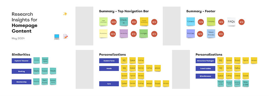
Summary of Top Navigation Bar and Footer Content Structure
Constraints
Given more time and resources, I think it would be beneficial to conduct the competitors’ research alongside the other designers in the team. With only 2 people, the pros and cons that we noted may not be comprehensive of what others think. As such, this may create biased opinions when it comes to identifying potential areas for improvement.
Future Directions
After understanding the pain points that users face and the industry best practices, it is important to narrow our target audience to a few personas that capture the majority of users. A user journey map can then be constructed for each persona to understand their behaviors. This will aid in the ideation process in which a few users can partake in a design studio to share their thoughts on how they would like the homepage to be revamped. It is crucial to involve the users as designers may have their own biased assumptions.